
Nuclear Science User Facilities
NSUF Brand Refresh and Signage
Graphic design for event signage, printed materials, and on-site visuals supporting the awards program.

Project Overview
NSUF requested a refresh of their existing brand to make it more impactful and consistent. After meeting with the client, we refined color and logo usage and mapped out how those updates would carry across a full suite of materials for a cleaner, more cohesive look.
To bring more impact to NSUF’s existing brand, I started by refreshing the logo and refining the color palette to better connect with their target audience. From there, I built out a set of supplemental materials that showed the updated system in action, making it easy to apply across signage, flyers, reports, and web layouts. The goal was simple: create a look that feels cohesive everywhere NSUF shows up, without leaving room for guesswork.
NSUF also works closely with Idaho National Laboratory (INL), so it was important that the refreshed brand could sit comfortably alongside INL’s visual presence without blending into it. I kept compatibility in mind as I refined the logo and color system, making sure NSUF felt cohesive in shared materials while still reading as its own distinct, independent brand.

Refreshed NSUF’s brand with an updated logo, stronger color palette, and cross-platform templates that align well with INL while standing on their own.
Final Design
Brand Refresh and Brand Guides
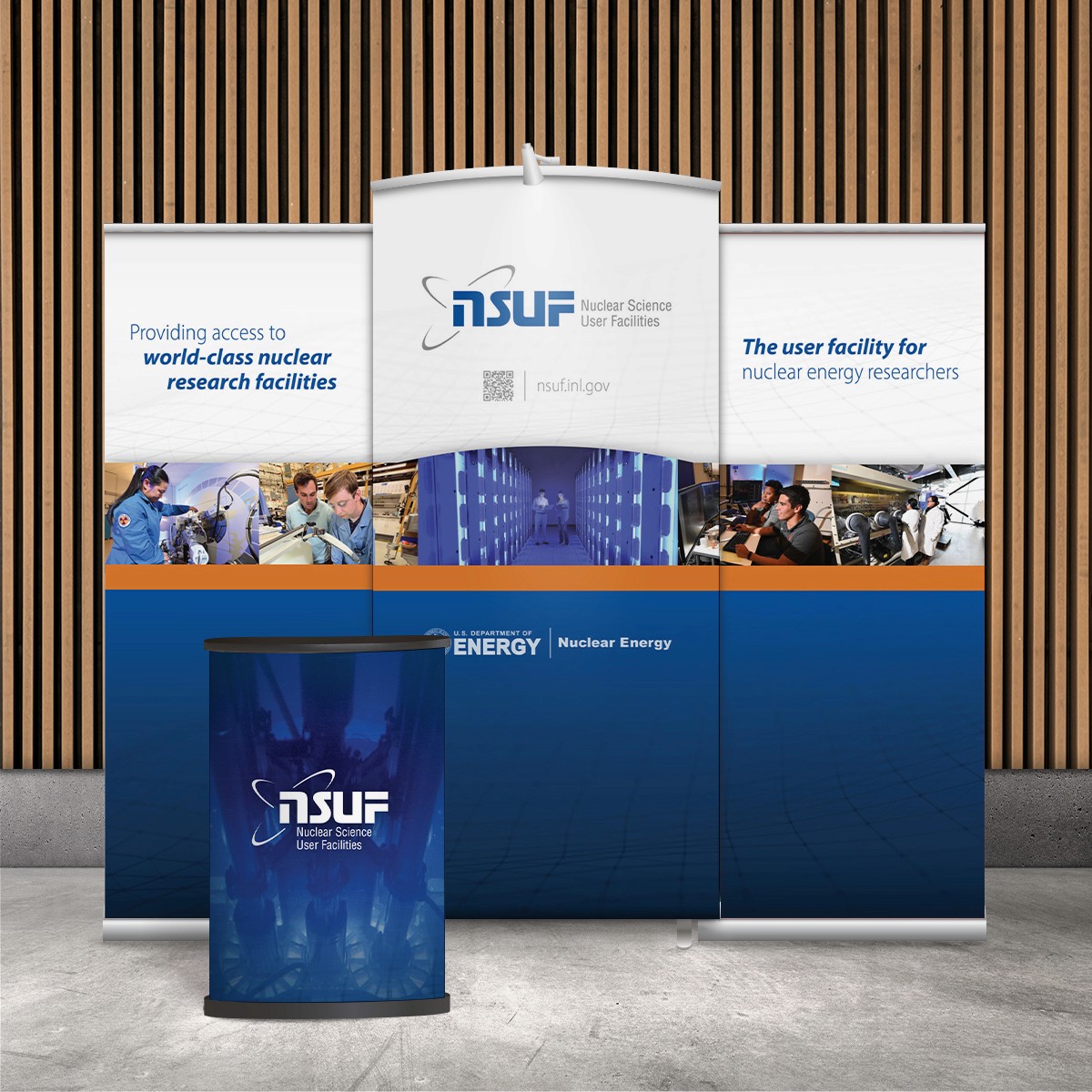
Physical Signage
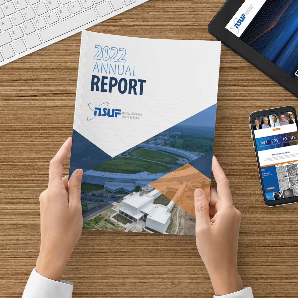
Annual Report
Web Brand Refresh
Print Flyers/Factsheets
In the end, the refresh gave NSUF a stronger, more unified brand system that’s easy to use and hard to miss. With an updated logo, a more impactful color palette, and clear real-world examples across print and digital materials, NSUF can show up consistently across every platform while still pairing cleanly with INL when needed and standing confidently on its own. The final suite of assets created a clear standard for future materials, helping the team move faster while keeping everything on-brand.
More Images


"Creative success is when communication meets innovation. When artists incorporate the individual communication goals with innovative and inspired design, we know we have achieved creative success."

Nuclear Science User Facilities
NSUF Brand Refresh and Signage
Graphic design for event signage, printed materials, and on-site visuals supporting the awards program.
Project Overview
NSUF requested a refresh of their existing brand to make it more impactful and consistent. After meeting with the client, we refined color and logo usage and mapped out how those updates would carry across a full suite of materials for a cleaner, more cohesive look.
To bring more impact to NSUF’s existing brand, I started by refreshing the logo and refining the color palette to better connect with their target audience. From there, I built out a set of supplemental materials that showed the updated system in action, making it easy to apply across signage, flyers, reports, and web layouts. The goal was simple: create a look that feels cohesive everywhere NSUF shows up, without leaving room for guesswork.
NSUF also works closely with Idaho National Laboratory (INL), so it was important that the refreshed brand could sit comfortably alongside INL’s visual presence without blending into it. I kept compatibility in mind as I refined the logo and color system, making sure NSUF felt cohesive in shared materials while still reading as its own distinct, independent brand.
Final Design
Brand Refresh and Brand Guides
Physical Signage
Annual Report
Web Brand Refresh
Print Flyers/Factsheets