Idaho NAtional Laboratory
INL F&SS Management Plan
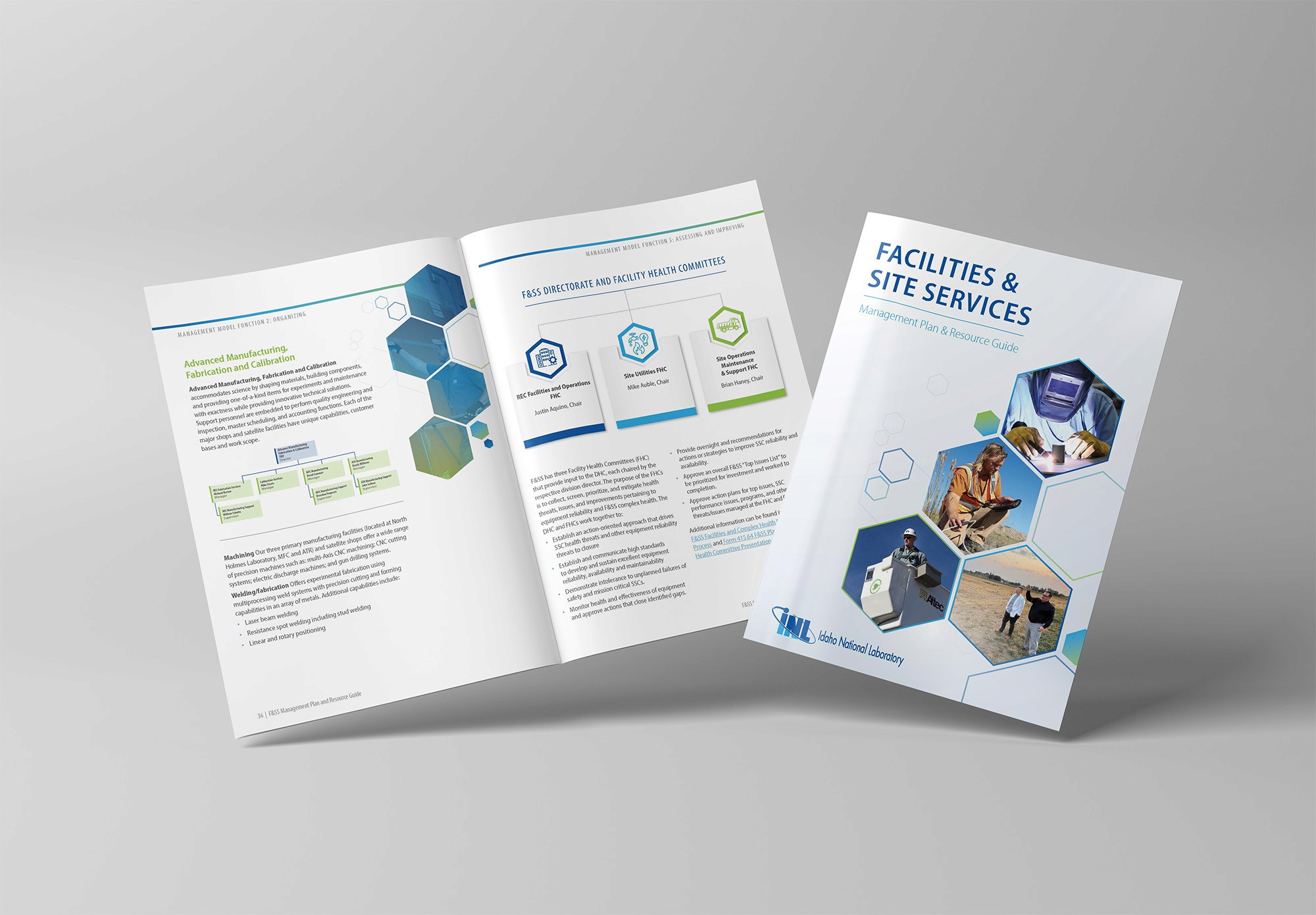
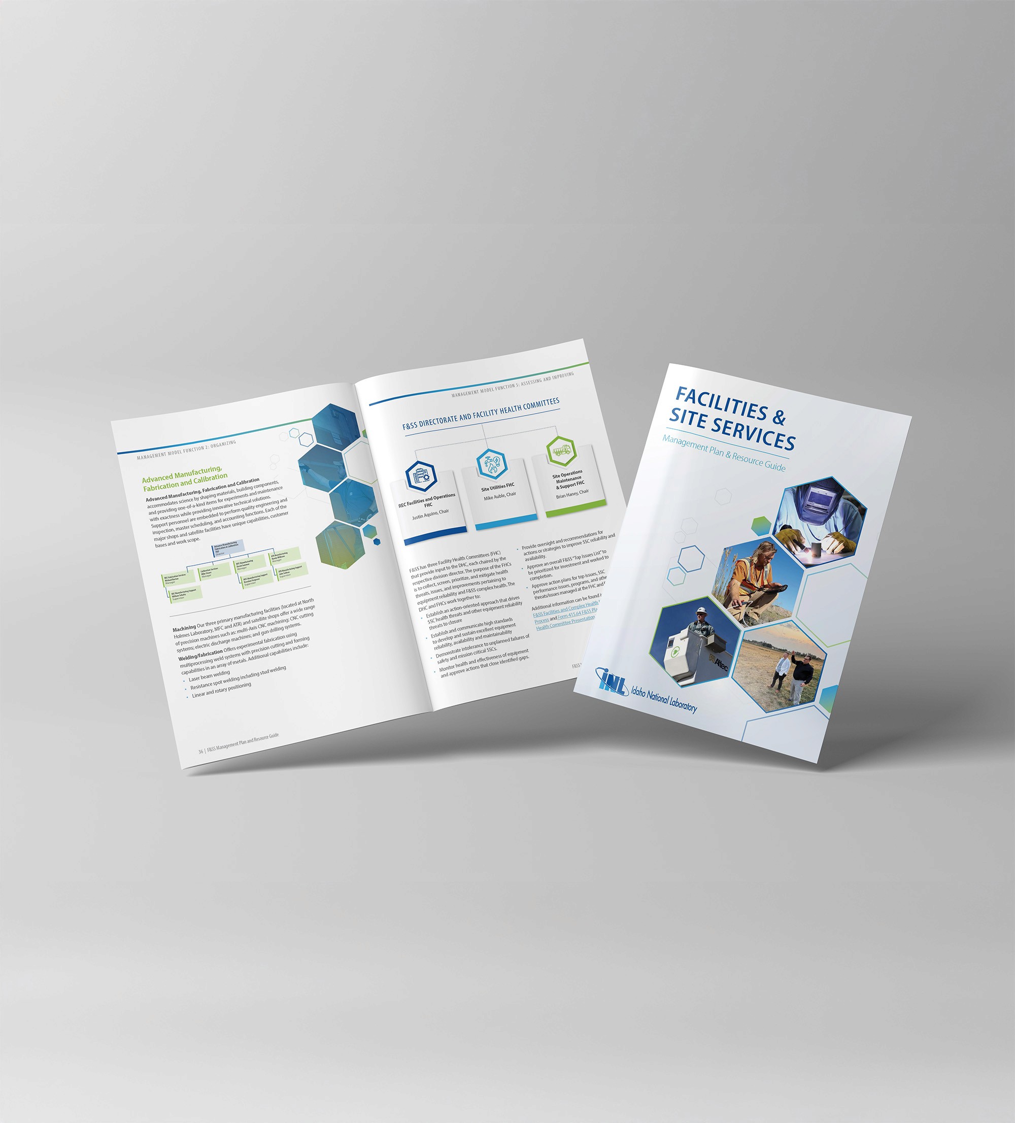
A clean, easy-to-read booklet that invites employees in with bold, large-format type.
July 2026
Project Overview
INL’s Facilities and Site Services came to me with a clear goal: make communication cleaner, sharper, and fully aligned with INL’s One Lab initiative. To get there, I blended INL’s established branding, color palette, and core assets with division-specific photography, creating a seamless, information-rich document that still feels approachable and easy to move through.
After sketching the first concepts, I brought a set of rough layout directions into InDesign and started building the structure with real content. I flowed the text in early, testing multi-column layouts to add rhythm and keep the pages visually interesting without sacrificing readability. From there, I sifted through the photo library and selected images that fairly represented each F&SS division across the document. To reinforce INL’s One Lab initiative, I echoed INL’s signature hexagon element throughout the design, then used the color palette consistently to lock in brand cohesion from cover to close.
I partnered closely with an INL editor to make sure every section was accurate, clear, and placed exactly where it made the most sense. To keep edits smooth and stress-free, I ran the document through WordsFlow, an InDesign plugin that lets us push text out to Word and bring revisions back in without breaking the layout. That workflow kept everything consistent, reduced back-and-forth, and gave the editor confidence that nothing got lost between drafts.
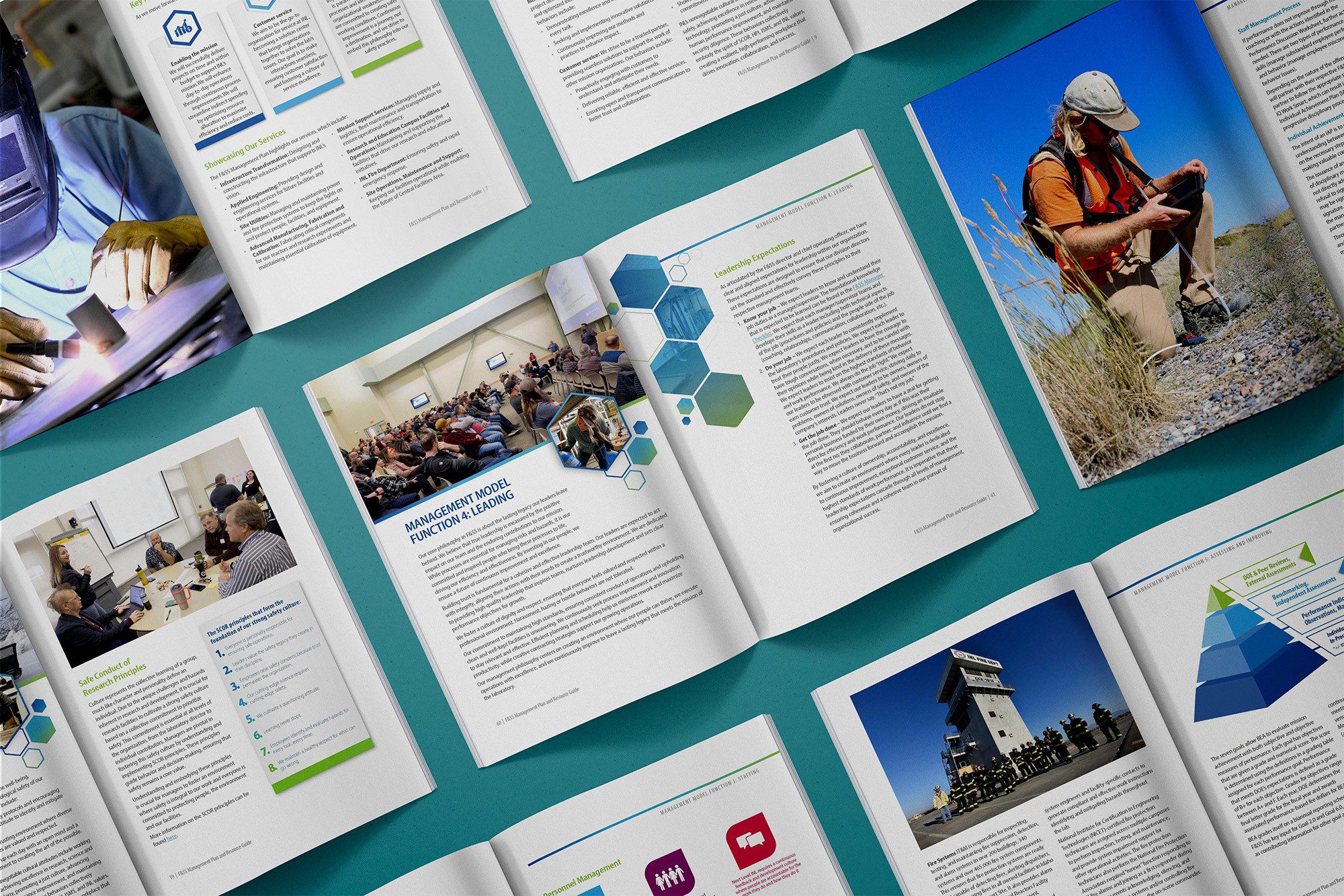

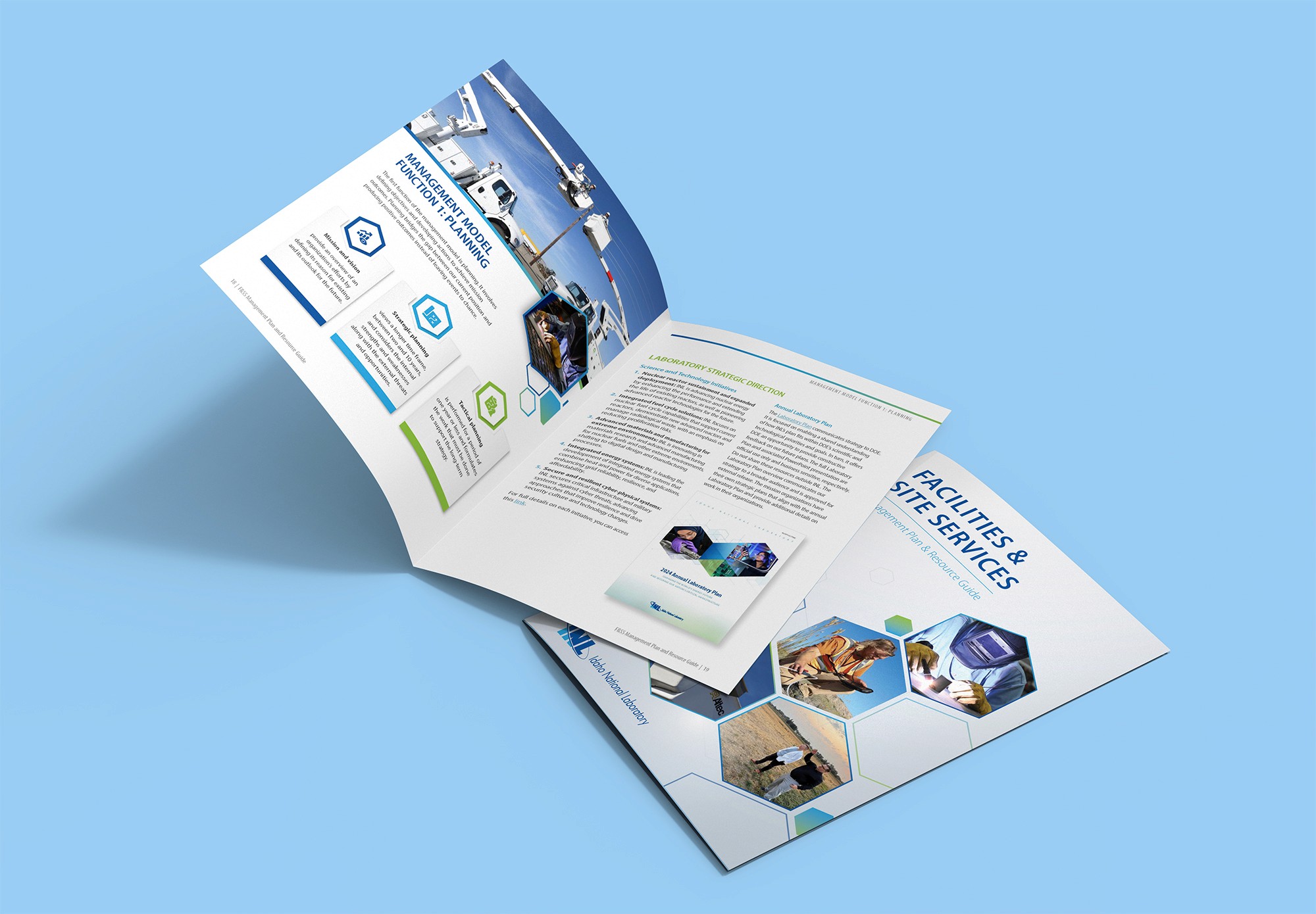

Designed an INL One Lab–aligned F&SS document by combining INL branding, balanced division photography, and a smooth editor workflow into a clean, easy-to-read, information-rich layout.
Idaho NAtional Laboratory
INL F&SS Management Plan
A clean, easy-to-read booklet that invites employees in with bold, large-format type.
Project Overview
INL’s Facilities and Site Services came to me with a clear goal: make communication cleaner, sharper, and fully aligned with INL’s One Lab initiative. To get there, I blended INL’s established branding, color palette, and core assets with division-specific photography, creating a seamless, information-rich document that still feels approachable and easy to move through.
After sketching the first concepts, I brought a set of rough layout directions into InDesign and started building the structure with real content. I flowed the text in early, testing multi-column layouts to add rhythm and keep the pages visually interesting without sacrificing readability. From there, I sifted through the photo library and selected images that fairly represented each F&SS division across the document. To reinforce INL’s One Lab initiative, I echoed INL’s signature hexagon element throughout the design, then used the color palette consistently to lock in brand cohesion from cover to close.
I partnered closely with an INL editor to make sure every section was accurate, clear, and placed exactly where it made the most sense. To keep edits smooth and stress-free, I ran the document through WordsFlow, an InDesign plugin that lets us push text out to Word and bring revisions back in without breaking the layout. That workflow kept everything consistent, reduced back-and-forth, and gave the editor confidence that nothing got lost between drafts.
